Given the strong market performance year-to-date, now is a suitable time to filter the noise and search for market signals. Whether the technology sector leading the stock market to the upside is a signal of a trend change is a paramount question.
From the December 2022 report “Technology outlook for 2023,” the following passage provides context for the Technology sector gains thus far this year (emphasis added).
It is worth noting that January is known for technical bounces as tax loss selling abates. Regardless, the message of the market is not bullish… Technically speaking, the XLK remains in a downtrend.
The January-effect is a well-documented market regularity. As this was to be expected, the question now turns to whether the strong upward move year-to-date also contains a signal regarding a change in the primary trend.
The Stock Market
The following 2-year daily chart of the Technology Select Sector SPDR® Fund (NYSE:XLK) displays the current trend in the technology sector. Note that the orange horizontal line is the minimum price required to signal a possible trend change.
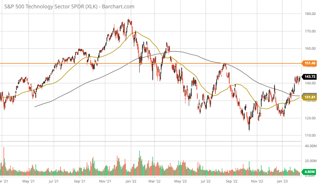
Technology Select Sector SPDR® Fund XLK 2-year daily chart. Created by Brian Kapp using a chart from Barchart.com
Confirming the continuation of the primary downtrend, the 50-day moving average (gold line) is beneath the 200-day moving average (grey line). Importantly, the orange line also represents the neckline of a head and shoulders top from late 2021 to early 2022. The technology sector within the S&P 500 index remains in a bear market and is nearing what should be heavy resistance at the neckline.
The technology sector has the largest influence by far representing a quarter of the broad US market, with the next nearest sector weight in the mid-teens. In fact, the technology top coincided with a head and shoulders top in the broad market indices, which was covered in my March 25, 2022 report, “SPY: The death cross and what you need to know.” This is how I summarized the situation in March 2022:
The stock market is in a primary downtrend with all three major US averages experiencing a death cross… This points toward a primary near-term downtrend being the most likely base case over the coming months to year… the bearish signal must be respected.
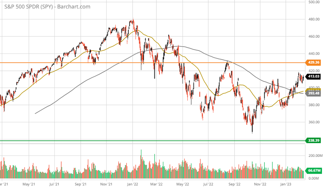
The S&P 500 (NYSE:SPY) remains in a primary downtrend as can be seen in the following 2-year daily chart. It is nearly identical to the technology sector with one exception, a golden cross occurred in early February, with the 50-day moving average crossing above the 200-day moving average. Like the technology chart above, the orange line represents the head and shoulders neckline and minimum price required for a primary trend reversal.
While the downtrend remains in place, the golden cross in the broad market is technically bullish relative to the tech sector. The relative technical attractiveness of the broad market compared to the technology sector is reflected in the fundamentals via the valuation differential.
The Nasdaq 100 (NASDAQ:QQQ) (used here as the technology sector valuation proxy) trades at a 40% premium to the broad market as defined by the S&P 500. A cross section of stock market valuations is displayed below and was compiled from the Wall Street Journal.
The large valuation premium in the technology sector is complicated by declining earnings expectations, as can be seen in the yellow highlighted cells. Transportation is the only index trading at a discount to historic market averages, while the remaining indices trade at a premium to historical valuations. The Eyld column, or forward earnings yield, is especially informative in relation to interest rates.
The Bond Market
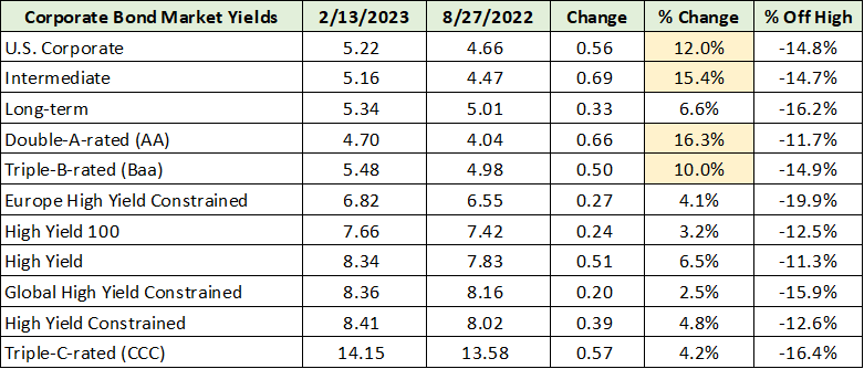
Interestingly, the broad US stock indices are trading in the range of 4% to 5% on a forward earnings yield basis, which is on par with the yield in the higher-quality end of the bond market today. The following table displays corporate bond yields and was compiled from the Wall Street Journal. I include yields as of my last bond market update following Jackson hole on August 29, 2022: “S&P 500: Where we go after Jackson Hole.”
Yields in the 5% to 8% range compare well with the 4% to 5% earnings yield available in stocks. The higher-quality end of the market yield changes (yellow highlighted cells) have confirmed the outlook from the August 2022 report:
The higher-quality segments of the bond market… continue to face material interest rate risk. Conversely, the lower-quality sectors appear to have largely priced in the current rate hike cycle.
The bond market has been offering many relative opportunities of late, with the lower quality end performing relatively well over the past six months. Notice that all interest rates are off the recent highs by similar mid-teen percentage amounts. The relative opportunities across the corporate bond market are less pronounced today.
Risk-Free Yields
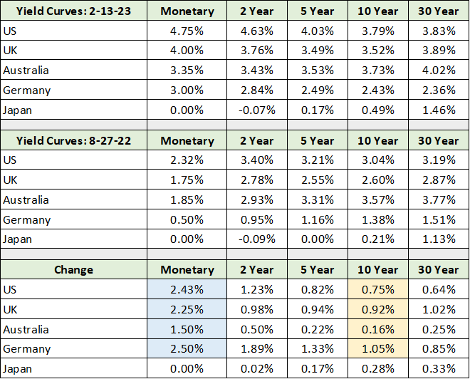
This is decidedly not the case in the risk-free bond market as relative opportunities remain pronounced. The US government bond market is especially attractive compared to its largest peers (ignoring currency considerations). As can be seen in the following table compiled from Bloomberg, yields on US Treasuries dwarf those available in Japan and Germany. While the UK and Australia are becoming competitive, the yield differentials are material on the short to intermediate end of the curve (up to five years).
I have highlighted key yield changes since the Jackson Hole report. Notice that overnight or monetary rates have increased materially in relation to the yields on 10-year government bonds. As 10-year bonds serve as a risk-free anchor for valuations across markets, the marginal yield increase over the past six months has aided the recent market bounce.
The flat to inverted risk-free yield curves above, with long-term rates lower than short term rates, has alleviated the intense pressure on valuations across markets. For example, the 3.79% yield on the US 10-year treasury remains well below historical norms, thereby suppressing discount rates used in valuations. This has had the effect of supporting above-average valuations across the stock market during the recent rally.
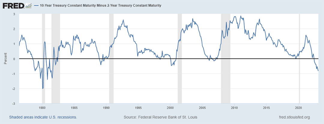
Complicating matters, inflation remains well above historical norms at nearly twice the yield on the US 10-year bond. The following chart courtesy of the St. Louise Federal Reserve displays the inversion of the US yield curve, defined as the 10-year yield minus the 2-year yield.
With the US 10-year yield 0.84% below the 2-year yield, the yield curve is the most inverted since the 1978 to 1982 period. The primary difference between today and the prior period is that interest rates were in the process of reversing from a secular uptrend to a secular downtrend during the 1978 to 1982 timeframe.
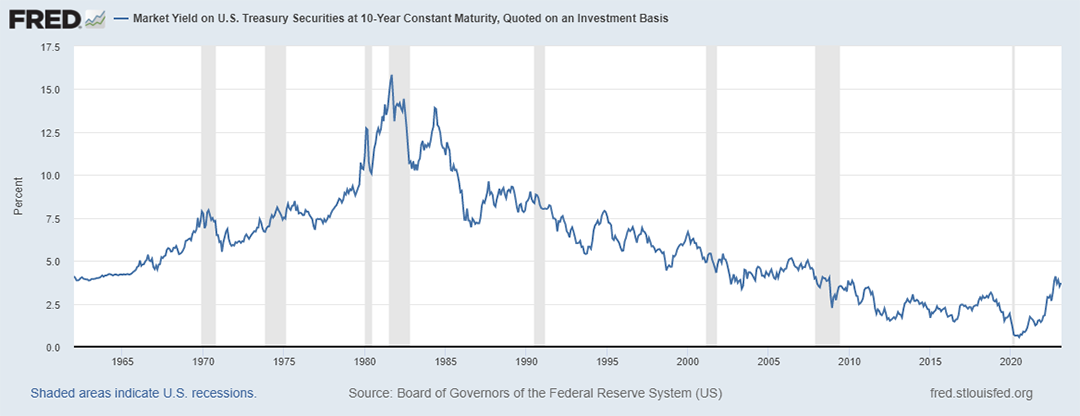
Today, the situation is the exact opposite. Rates are now reversing from a secular downtrend, which bottomed out at extreme lows, to what is likely to be a secular uptrend. The following chart of the 10-year US Treasury yield from the St. Louis Federal Reserve captures the secular trends. Notice that the 10-year yield remains at levels first reached during the panic lows of the 2008 financial crisis.
Whereas the US government bond market is the most attractive from a yield perspective, this is decidedly not the case at the long end of the yield curve (10-years plus). The curve inversion is likely to reverse via long-end rates moving higher rather than short-term rates moving lower.
Supporting this view is the fact that inflation is highly likely to remain structurally above the Fed’s 2% target over the intermediate term. As a result, the prospect of rate cuts looking into 2024 is minimal. When combined with the clear evidence of a secular rate reversal in the above chart, the relative bond market opportunities in the US Treasury market are at the short to intermediate end of the curve.
For a sense of the risk at the long end of the risk-free bond market, the iShares 20+ Year Treasury Bond ETF (NASDAQ:TLT) serves as an excellent example. The yield is 3.7% with an effective duration on the portfolio of 17.5 years. Duration is a rough measure of the percentage price change that can be expected given a 1% change in rates.
If yields on the long end of the US Treasury curve increase from 3.7% to 4.7%, which appears highly likely, the bond fund is expected to lose 17.5% of its value.
Summary
The fundamental and technical signs point to the broad US stock market nearing a short-term peak. Technically, the head and shoulders neckline from the topping process looms large. From a fundamental perspective, valuations remain extended in relation to the historical evidence and near-term earnings growth.
Complicating matters, the secular rate reversal should continue placing pressure on asset valuations as the yield curve inversion resolves itself through higher long-term rates rather than lower short-term rates. Risk remains extreme at the long end of the bond market, with relative opportunities across the short to intermediate end of the curve.
In terms of opportunities in the broad stock market, valuation compression remains the primary risk. This is supported by the outlook for higher long-term rates and the current earnings contraction in the Nasdaq 100.
As a result, the relative opportunities in the stock market reside in those segments and sectors which are trading at discounted valuations. These opportunities are prevalent in the small to mid-cap value segments of the US market and stretch into the large-cap segment. Recent examples of such opportunities can be found in the following reports:
- “Rio Tinto is going up”
- “Real estate opportunities in the Big Apple”
- “Asset opportunities in small-cap value”
- “Eastman’s bull market is nearing full bloom”
- “BorgWarner has the pieces for a bull market”
- “Comcast is riding the information wave”
- “Relative opportunities in energy for 2023”
- “A top sector choice for the coming cycle”
A portfolio composed of opportunities similar to the above list would carry a single digit PE ratio with an earnings profile similar to or more attractive than the broad market averages.
As the broad markets remain in a primary downtrend, and the trend is your friend, go with the cash flow.


