
It’s like déjà vu all over again.
To look forward we must first look backward. The above quote, attributed to Yogi Berra, encapsulates the current state of the US economy, and gets to the heart of the matter in terms of the economic outlook.
US Economic Outlook
We have seen versions of the current movie before. The following chart, courtesy of the St. Louis Federal Reserve, sets the stage for gauging the baseline of the US domestic economy. It displays the US federal deficit as a percentage of the economy as measured by GDP (Gross Domestic Product).
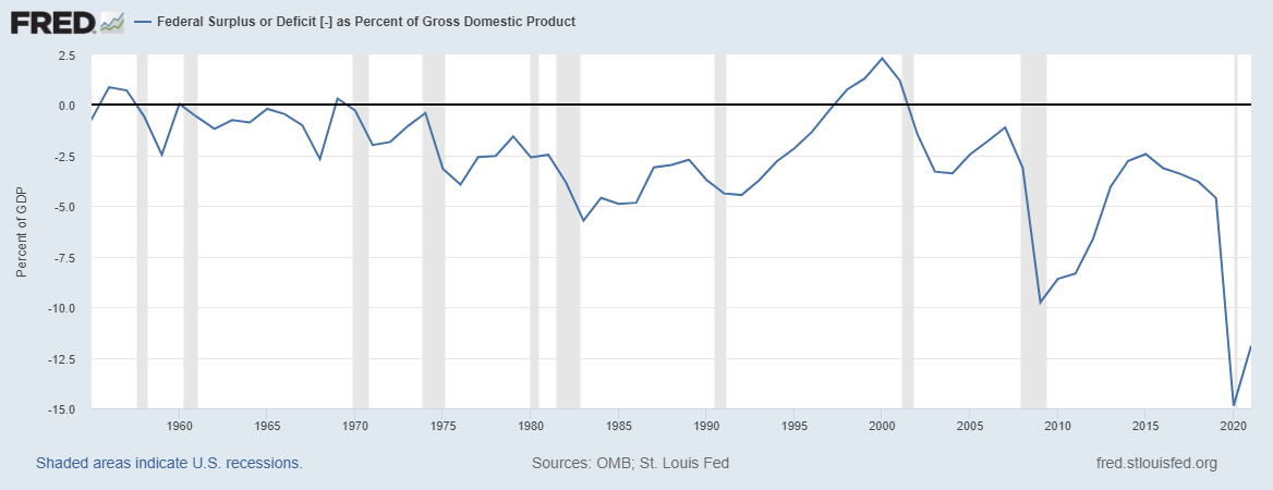
Source: St. Louis Federal Reserve
The US Economic Pathway
Following the 1970’s inflationary episode, the US deficit had a central tendency toward -5% of GDP from the early 1980s into the early 1990s. This was a decade of solid economic performance. As the 1990s unfolded, the stable deficit regime near -5% of GDP was transformed into the largest surplus in modern times of around +2.5% by the year 2000. This represented a tightening of fiscal conditions to the tune of 7% of GDP.
When one considers that US federal deficits are in fact high-powered money creation, the surplus that coincided with the dot-com peak was ominous. Essentially, fiscal conditions were the tightest in modern times at the exact moment that one of the largest stock market bubbles of all time began to deflate.
The deficits following the 2000 surplus, which reached -10% of GDP in 2009 and -15% of GDP in 2020, reflected the ominous starting conditions. Notice that the deficit was restricted to -2.5% of GDP in the first half of the 2000s. With evidence for a stable deficit tendency near -5% of GDP, fiscal policy remained relatively restrictive until the 2008 financial crisis.
This may partially explain the emergence of the QE monetary policy regime. This included near 0% interest rates beginning in the early 2000s and 0% rates after 2008. Following the 2008 financial crisis, the deficit was again brought back to -2.5% of GDP by 2014 before rolling over to near -5% by 2019, and then collapsing to -15% during the COVID pandemic.
Whereas the US economy regularly grew by 3% to 4% per year during the 1980s and 1990s, the 2000 to 2020 period witnessed half that annual growth rate. The fact that this halving of growth occurred during a time period of massive deficit expansions hints at the possibility of capital misallocation. Symptoms of capital misallocation are lower productivity and higher inflation, which are manifest today.
Employment
A casual glance at the above deficit-to-GDP chart suggests that the US domestic economy has experienced incredible periods of stress since 2000. This stress is best evidenced by labor market conditions. The following chart, courtesy of the St. Louis Federal Reserve, displays total US employees as reported in US Nonfarm Payroll data. Notice that the upward slope was halted in 2000 and did not resume until well after 2010.
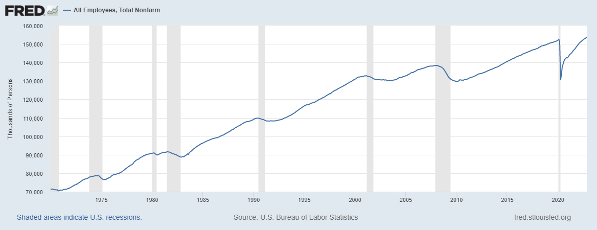
Source: St. Louis Federal Reserve
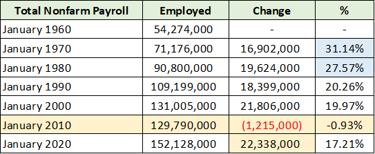
The following table displays the total number of employed at the start of each decade and was compiled from the data underlying the above chart. I have highlighted in yellow the employment data for the 2000 to 2010 decade as well as the total change in employment for the 2010 to 2020 decade.
Source: St. Louis Federal Reserve. Created by Brian Kapp, stoxdox
The US lost 1.2 million jobs during the first decade of the new century. There is no modern precedent for this level of labor stress. While the 22.3 million jobs created between 2010 and 2020 is healthy and similar to prior decades, it is quite weak considering the lost decade that preceded it. Furthermore, the 2010 to 2020 period saw the largest US generation ever enter the labor force, the Millennials, at over 72 million people.
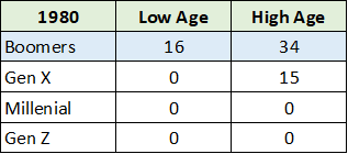
I have highlighted in blue the employment growth rate for 1960 to 1970 and 1970 to 1980, which saw exceptional growth compared to the most recent decades. In the context of such rapid employment growth, the 1970’s inflationary episode makes sense. The cause of the rapid employment growth can be found in the following table which displays the age range of the baby boomer generation as of 1980.
Source: St. Louis Federal Reserve. Created by Brian Kapp, stoxdox
By 1980, the entire baby boom generation had officially entered the working age population. The US working age population is defined as those between the ages of 15 and 64. Notice in the prior table that employment growth remained healthy during the 1980s and 1990s, registering 20% in each. The strong growth prior to the 2000 employment peak was aided by the labor force participation rate, which is displayed below.
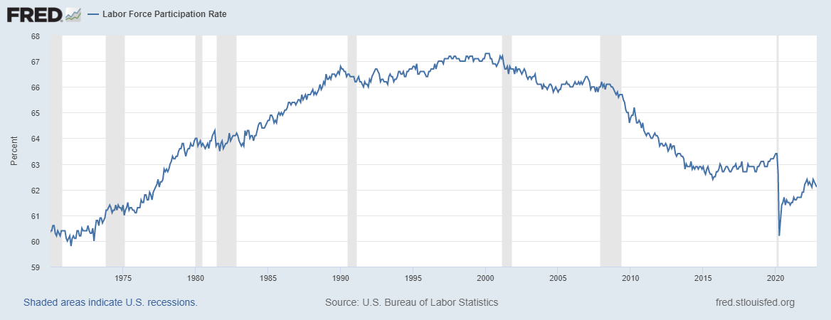
Source: St. Louis Federal Reserve
The baby boom generation entering the workforce into 1980 received a strong tailwind from the unfolding uptrend in labor force participation. Importantly, notice that the lost employment decade of 2000 to 2010 coincided with the labor force participation rate reversing lower and entering a downtrend, which remains in effect today.
The following table compiled from the St. Louis Federal Reserve and sourced from the OECD displays the number of employed people in the US working age population (ages 15 to 64). This labor view begins to illuminate the state of current US economic conditions.
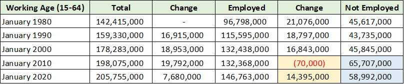
Source: St. Louis Federal Reserve. Created by Brian Kapp, stoxdox
Over the past two decades, employment growth in the working age population has averaged roughly 7 million jobs per decade (highlighted in yellow). This is 60% to 70% below the working age employment growth during the prior three decades. I have highlighted in blue the number of working age people not employed in the US. Compared to a normal level near 45 million preceding 2000, 20 million additional people (in the working age population) were not working as of January 2010.
Employment Trends
All economic activity begins with income and thus employment. Employment is arguably the most important factor in viewing economic potential. The US economic story is told in two parts, pre and post 2000. The post-2000 employment picture is summarized in the table below which combines data from the charts used thus far. I have highlighted in blue the increase in the number of working age people not employed since 2000.
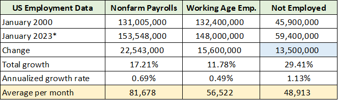
Source: St. Louis Federal Reserve. Created by Brian Kapp, stoxdox
What we can say is that the US has roughly 13.5 million people of working age that are not employed compared to the 2000 labor participation inflection point. This fact strongly suggests that the US does not have a tight labor market. In fact, this data points to the US having a tight job market, generally speaking. Slack in the US labor force is elevated and suggests that noninflationary growth potential in the US economy is going unrealized.
As a result, reports of wage inflation being a problem are highly likely to be a case of supply and demand mismatches in the labor markets rather than of a tight labor market per se. For example, workers in skilled trades were in short supply during the COVID housing boom, however, that is not reflective of broad US labor conditions. Similarly, the service sector was disrupted during that time, which led to short-term labor shortages.
I have highlighted in yellow the monthly averages for employment since 2000. Nonfarm payrolls have averaged roughly 82,000 total jobs created per month. This level of employment growth is decidedly weak. Turning to the working age population, nearly equal amounts of people have become employed and not employed, at roughly 57,000 and 49,000 per month, respectively. 57,000 jobs per month amounts to only 0.3% of the working age population per year. The sustainable growth baseline that this level of job creation can support is meager at best.
Social Tax Evidence
One area that I view as being especially informative regarding the employment situation is social tax collections in the US (Social Security and Medicare taxes). These taxes are collected on the first $147,000 of wages and thus capture the employment trends for the vast majority of workers. The following table compares the growth rate of social tax receipts to employment and includes my estimate of underlying wage growth.
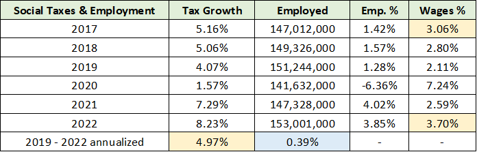
Source: St. Louis Federal Reserve. Created by Brian Kapp, stoxdox
I have highlighted in blue the total Nonfarm payroll growth per year since 2019. The 0.39% employment growth per year is in line with the 2000 to 2023 growth rate of 0.3% for the working age population. Recent employment trends support the view that the US has a tight job market rather than a tight labor market.
I have estimated the annual social tax receipt growth to be 4.97% per year since 2019 (highlighted in yellow) after removing the effects of increases in the income level that is taxable. My estimate of wage growth between 2017 and 2022 is in the 3% to 3.7% range, also highlighted in yellow.
There is little evidence of a hot or tight labor market in the US, generally speaking. If anything, there is evidence of the opposite, a tight job market. Furthermore, wage growth in the 3% to 3.7% range is meager from a historical perspective and remains well below recent inflation rates near 7%.
In summary, current conditions in the US labor market appear to be structurally weak as has been the case since 2000.
Generations
Taking a generational view adds additional context into understanding employment trends and the baseline economic growth potential of the US entering 2023. The US has six generations as summarized in the table below compiled from Statista. I have color coded similar-sized generations for ease of comparison. The Millennials and Boomers are similar in size as are Gen X and Gen Z.
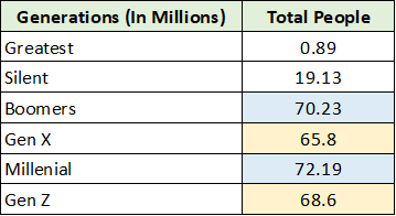
Source: Statista. Created by Brian Kapp, stoxdox
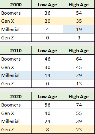
In terms of economic potential, it is important to note where each generation is in its employment lifecycle. In the table below, I have noted the age range of each group at the turn of the past three decades. This places the employment data thus far into greater context. Please note that the Boomers were covered above, and that the entire generation was of working age by 1980.
Created by Brian Kapp, stoxdox
By the year 2000, Gen X was entirely of working age while the Millennials reached working age by around 2010. As the largest generation in the US, the Millennials are the most important economically. Their ages today range from 26 to 41.
A natural headwind for the US economy is the smaller size of Gen Z, who will be entering the workforce from 2020 to 2030 and beyond. There will be nearly 4 million less Gen Zers than Millennials. Interestingly, Gen X is roughly 4 million smaller than the Boomers.
Of note, Gen Xers were fully entering the workforce into the 2000 labor participation peak and were between the ages of 20 and 35 at the time. With Millennials aged 26 to 41 today, there is a heightened risk of another lost decade of employment growth considering the similar decrease in generational size looking forward.
For reference, from 2010 to 2020, the Millennial generation’s influence resulted in real GDP growth of between 1.5% to 2.9% per year. While it was the longest economic expansion in modern times, it was also the weakest. As noted earlier, the 1980s and 1990s featured 3% to 4% real growth as the central tendency.
From a generational perspective, the US economic baseline is tilted toward structurally slower economic growth over the intermediate term. This confirms the structurally weak economic growth outlook suggested by the employment data.
“If you have to forecast, forecast often”
The above quote is attributed to economist Edgar Fiedler. He was in the US Treasury department during the 1970’s inflation outbreak. In the 1973 presentation, “Assistant Secretary Fiedler before the Conference Boards, Waldorf Astoria Hotel, New York City (“Business in 1974”), September 25, 1973,” he spoke of 6.5% wage gains as being normal and not the primary driver of the 1970’s inflation shock. From a historical perspective, today’s 3% to 4% wage gains are most certainly not the drivers of the current inflationary spike.
Similar to the situation today, he described the two primary drivers of the 1970’s inflation, commodity prices and accelerating global growth. These factors are likely to be drivers of inflation through 2030, if less extreme than the 1970s. The most interesting note from the presentation is that 6.5% wage growth was considered a baseline and not an extreme in the early 1970s. This highlights a fundamental reality of social-economic systems, which is that baselines shift over time.
With the natural demographic risk tilted to slower economic growth in the US over the intermediate term, barring a material reversal in the participation rate, wage growth may in fact need to reach a higher baseline in order to compensate for the structural downside risks.
While Gen Z is roughly 4 million smaller than Millennials, there remains 13.5 million people not employed in the working age population that could easily fill the gap. In this light, the US could reestablish baseline economic growth in the historic 3% to 4% range if it can broaden economic participation.
We are at a critical juncture for the US economy. The current cycle shares many similarities with the 2000 bubble pop and labor participation reversal in addition to similarities with the 1970’s inflationary episode. As the saying goes, while history may not repeat, it often rhymes. “It’s like déjà vu all over again.”
Where Are We?
In “FedEx and the recession” and “The recession is here filter the noise,” I reviewed the existing recessionary conditions for economic bellwethers and key sectors of the economy. Today, many market observers are uncomfortable with the overwhelming consensus that a recession will unfold in 2023. From my perspective, we are in a recession now, officially declared or not. The following passage from the September 1973 Fiedler presentation, in referring to the effects of inflation, offers an interesting corollary.
The people are so confused by these events that in July a public-opinion poll registered the dominant belief of Americans to be that the economy is in a recession.
At the time of the 1973 presentation, the economic establishment saw no risk of recession on the horizon. An official recession was later dated to have begun the month following Fiedler’s presentation and lasted through Q1 1975. Of note, employment did not peak until a year after the 1973 presentation. This is a reminder that employment, from an economic cycle perspective, is a lagging indicator.
Summary
From a 2023 outlook perspective, the good news is that the recession is occurring now and that financial markets price in the future. The year-to-date declines across the major market sectors, as discussed in “Technology outlook for 2023,” highlight the anticipatory pricing. Given the advanced nature of the market decline and recessionary conditions, this is an excellent time to search for opportunities. That said, it is also a time to remain mindful of the relative risks.
Structural growth deceleration due to demographics and generally weak labor markets combine with recessionary conditions and the popping of asset price bubbles to create a uniquely high-risk environment. It shares many similarities with the 2000 bubble pop and labor participation reversal in addition to similarities with the 1970’s inflationary episode. Similar to the dot-com bust of 2000, large financial bubbles are deflating in sync with an economic downturn and structurally weak employment trends.
The dissimilarities with the 1970’s inflationary episode are rooted in polar opposite initial employment conditions. In the 1970s, the baby boomers were entering the US economy alongside an expanding labor force participation rate. This led to extraordinary employment growth. As the 2020s unfold, the US faces a demographic drag from Gen Z combined with meager employment growth and a declining labor force participation rate.
This unique moment of heightened risk elevates the importance of making the correct policy choices while avoiding policy errors. The historical record suggests that easy monetary policy does not drive employment growth. Fiscal deficits near -5% are required as is the need for deficit spending to be better targeted towards real and sustainable economic growth.
Regardless, there are many attractive opportunities entering 2023 which are less exposed to the heightened risk conditions of the moment. Several recent reports covering the broad opportunities available in the energy sector are listed below. The energy sector opportunities are unique in the current environment in that they remain in a well-defined bull market trend.
- “Relative opportunities in energy for 2023”
- “Is the sun setting on energy stocks? ”
- “A top sector choice for the coming cycle”
- “CNX Resources: The Saudi Arabia of natural gas”
- “What Buffet sees in Occidental”
- “Schlumberger is an asymmetric opportunity with supercycle potential”
The energy opportunity extends into the materials sector as the energy transition is metals intensive. Additionally, the materials sector offers uniquely asymmetric risk/reward opportunities from a portfolio management perspective. Several opportunities were covered in the following reports:
- “Gold is on the efficient frontier”
- “Top commodities for the energy transition”
- “Eastman Chemical is entering a bull market”
- “Freeport McMoRan, Doctor Copper makes a house call”
- “Rio Tinto is a perfect portfolio diversifier”
Other sectors are identified as potential leaders entering 2023 in “Technology Outlook For 2023,” including healthcare and industrials. I will cover these sectors more broadly in coming reports. Recent opportunities covered include the following:
The above list is not meant to be comprehensive, but to highlight the fact that there is an expanding opportunity set becoming available as the economy and markets undergo a fundamental phase change. We have reached a uniquely high-risk and dynamic juncture in US economic history and look forward to covering the most asymmetric risk/reward opportunities as 2023 unfolds.
In conclusion, the following quote from Oaktree’s Co-Chairman Howard Marks from the “Technology outlook for 2023” report summarizes the current state of affairs quite well.
…the environment is and may continue to be very different from what it was over the last 13 years – and most of the last 40 years… investment strategies that worked best over those periods may not be the ones that outperform in the years ahead.