
As discussed in “A new copper bull market takes shape,” the fundamentals and technicals are in alignment in supporting a new copper bull market. Here, I will begin to review and update the three copper opportunities mentioned in the above report. The three companies and their performance from the last update through the January 30, 2023 copper report are as follows:
- Freeport McMoRan (NYSE:FCX): Reviewed positively in “Freeport McMoRan, Doctor Copper makes a house call” on July 7, 2022. The stock is now up 64% and trading at $44.82 compared to $27.38 at the time of the report.
- Rio Tinto (NYSE:RIO): Reviewed positively in “The dogs of stoxdox: Top 5 income stocks” on November 17, 2022. The stock is up 22% at $79.44 compared to $65.28 at the time of the report.
- Barrick Gold (NYSE:GOLD): Reviewed positively in “Gold is on the efficient frontier” on October 14, 2022. The stock is up 38% and trading at $19.58 compared to $14.16 at the time of the report.
Copper
The copper opportunity is intermediate to longer term in nature. In essence, copper supply and demand conditions look quite bullish into the 2030s. Fundamentals are conducive to an intermediate-term bull market for the miners. As a result, the primary strategic considerations in approaching the mining opportunities are largely tactical and technical in nature.
As copper and gold are found in similar geologic settings and often intermixed, a brief technical overview of copper and gold will set the stage for a review of the three miners. The following passage from my January 30 copper article captures the near-term technical setup for copper:
While new all-time highs are highly likely, a pullback to the $3.70 to $4 range is to be expected in the short term. Nonetheless, given the precarious nature of supply and the visible increase in future demand, the asymmetry in copper is to the upside.
Copper is now testing the upper end of this support zone near $4, as can be seen in the following 1-year daily chart. The primary short-term support at $3.70 is highlighted by the green horizontal line.
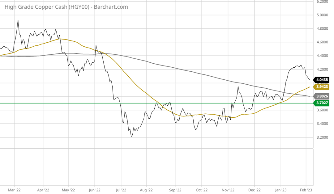
Copper 1-year daily chart. Created by Brian Kapp using a chart from Barchart.com
Note that the gold line is the 50-period moving average and the grey line is the 200-period moving average. Technically speaking, the 50-day moving average overtaking the 200-day moving average is bullish and is referred to as a golden cross.
The following 20-year monthly chart places the short-term price action into context.
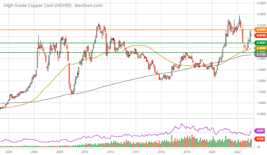
Copper 20-year monthly chart. Created by Brian Kapp using a chart from Barchart.com
Copper is sitting above long-term technical support (the green lines). Given the nearby support and lack of upside resistance, an eventual breakout above the orange line to new highs is highly likely in the coming years. In terms of support, notice that copper recently tested its 200-month moving average (the grey line). From a trend perspective, the 50-month moving average recently crossed above the 200-month moving average thereby sending a bullish long-term signal.
Gold
Of the three miners, gold is a meaningful contributor to Freeport and Barrick. In the case of Freeport, gold is projected to be 14% of 2023 sales, with copper contributing 75% and Molybdenum contributing 11%. For Barrick, the revenue split for 2023 is expected to be roughly 20% copper and 80% gold.
The technical setup for gold is quite similar to that of copper. In the short term, gold has been in a 2-year sideways consolidation as can be seen in the following 2-year daily chart. Like copper, gold is sitting on top of a key support zone which is highlighted by the green horizontal lines.
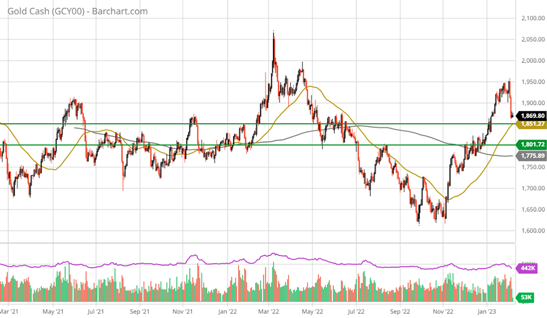
Gold 2-year daily chart. Created by Brian Kapp using a chart from Barchart.com
Gold has also recently experienced a golden cross with the 50-day moving average crossing above the 200-day moving average. The 2-year sideways consolidation in relation to the current bull market is on display in the following 5-year weekly chart.
Gold 5-year weekly chart. Created by Brian Kapp using a chart from Barchart.com
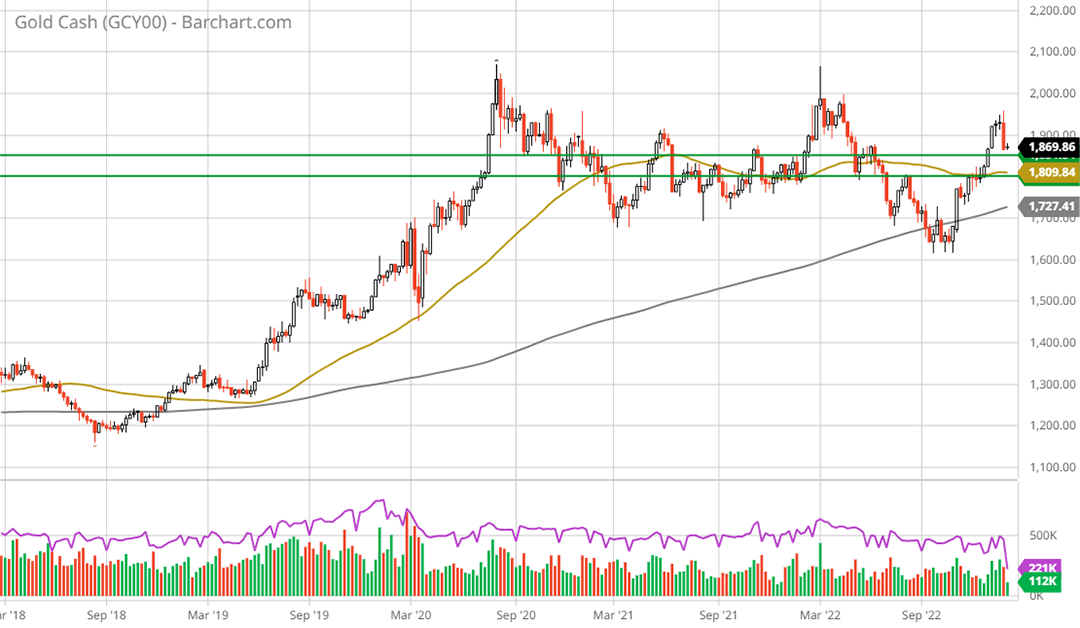
Notice that gold successfully tested its 200-week moving average (the grey line) which is currently near $1,727. This is likely to serve as strong support going forward. The following 20-year monthly chart offers a bird’s eye view of the technical setup.
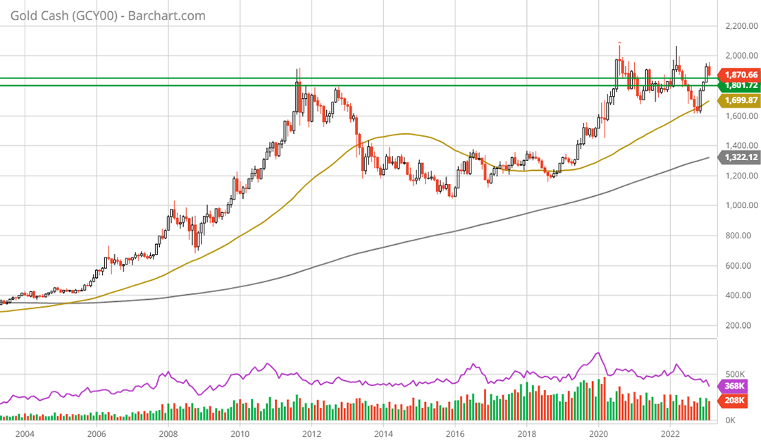
Gold 20-year monthly chart. Created by Brian Kapp using a chart from Barchart.com
Gold has formed a perfect cup and handle pattern following the peak in 2011, with its recent price action forming the handle. Looking to the intermediate to longer term, a bullish read of the above chart is the technical interpretation.
The Miners
A recent acquisition attempt by Newmont Corporation (NYSE:NEM) offers timely context within which to interpret the setup for the miners. Newmont has offered to purchase a top-tier miner, Newcrest, at a valuation of 8x cashflow or 15x earnings. The purchase offer is in Newmont shares which trade at a substantial valuation premium to those of Newcrest.
Newcrest owns perhaps the single best collection of top-tier gold mines, with long-life reserves. Such a low valuation at the top end of the sector evidences the muted consensus outlook for the miners. A resumption of the commodity bull market, as suggested above, would come as a large upside surprise for the mining stocks given today’s valuation climate.
Freeport McMoRan
In terms of the bullish copper outlook, Freeport McMoRan is a top-quality pure play. Freeport is similar to Newmont in that it is a top blue-chip miner in its sector. Newmont is a top gold producer while Freeport is a top copper producer. As a result, the valuation of Newmont’s shares offer a direct comparable for Freeport.
In reviewing the valuations, it is important to keep the relatively bullish copper price fundamentals in mind. As discussed in previous reports, the asymmetry is clearly to the upside for copper. Under visible conditions, projections of 50% upside potential into mid-decade are reasonably possible and, from my perspective, to be expected.
While gold could certainly reach a similar upside target of $3,000, there is no visible or fundamental reason for such a move. Nonetheless, a more moderate growth expectation in the low to mid $2,000 range for gold would be amplified many times over in miner earnings’ growth rates.
Given the relative growth outlook, there are fundamental reasons to expect that copper producers will trade at a premium to gold producers. In the following table I compare the consensus earnings outlook for Freeport to that of Newmont, and the related valuations. I have highlighted the valuation differential on the 2025 consensus earnings estimate for ease of valuation comparison.
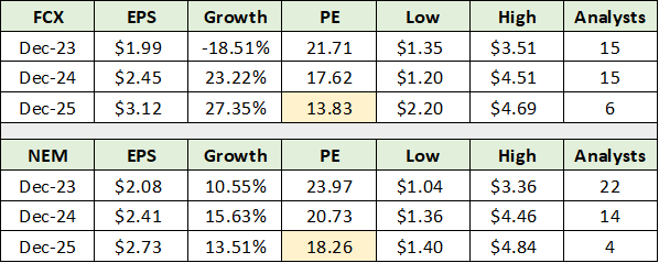
Source: Seeking Alpha. Created by Brian Kapp, stoxdox
Rather than a premium, Freeport trades at a steep discount to Newmont using a 3-year horizon. Freeport’s earnings growth is projected to be in the mid 20% range in 2024 and 2025. If Freeport were to close the valuation gap and trade at 18x the 2025 consensus, the upside would be 32% to $57 per share.
To place the $3.12 per share consensus estimate for 2025 in perspective, a copper price in the $5 to $6 range could translate into earnings in the $5 to $6 per share range for Freeport. In this light, the high-end estimate of $4.69 per share for 2025 is well within the realm of possibilities. At 18x the high estimate for 2025, the upside potential is 97% or $86 per share.
Technicals
With a visible upside into the $56 to $86 range and a bull market trend in place, the technical backdrop takes center stage. Freeport has traded sideways for two years as can be seen in the following 2-year daily chart. Note that the green line is primary support and that the gold and grey lines represent the 50-period and 200-period moving averages, respectively.
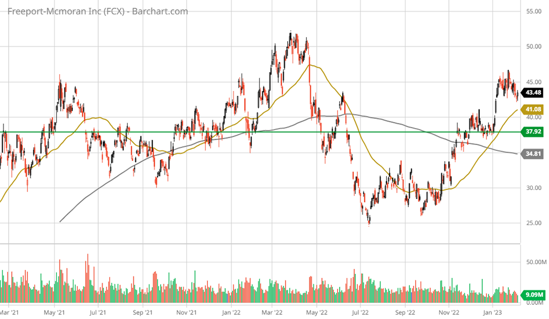
Freeport McMoRan 2-year daily chart. Created by Brian Kapp using a chart from Barchart.com
A golden cross occurred recently, sending a short-term bullish signal. Primary support is nearby in the $38 area or 12% lower. The following 5-year weekly chart displays the past two years of consolidation within the context of the current bull market trend.
Freeport McMoRan 5-year weekly chart. Created by Brian Kapp using a chart from Barchart.com
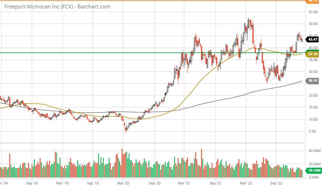
The recent double bottom near the 200-week moving average (the grey line) represents a strong technical bottom. While the initial move up from the COVID lows may appear extreme on the chart above, the following 20-year monthly chart places it into context.
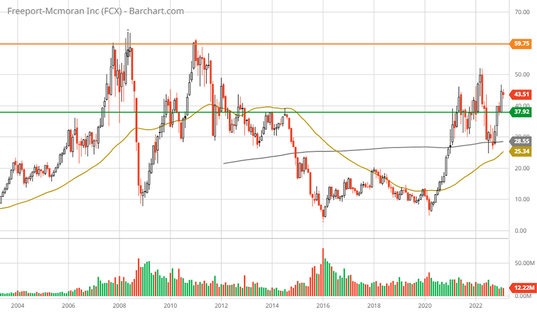
Freeport McMoRan 20-year monthly chart. Created by Brian Kapp using a chart from Barchart.com
The all-time highs near $60 in 2008 and in 2011 represent the only visible upside resistance, which is represented by the orange line. Given the valuation normalization estimate of $57, this looks to be easily achievable both fundamentally and technically.
Looking at the $86 upside target, an upside reflection of the deep and prolonged double bottom from 2016 to 2022 suggests that this is easily achievable under mild copper price scenarios.
Summary
As the new copper bull market takes shape, Freeport has completed the first leg up and consolidated the move over the last two years. The next leg of the bull market is likely to reach the $57 to $86 range, which is well supported on technical and fundamental grounds.
Tactically speaking, a retest near the $38 support zone would offer an opportunistic level at which to accumulate the shares. Given the duration of the sideways consolidation and a longer-term view, the shares are currently in an attractive accumulation zone.
Freeport is an asymmetric risk/reward opportunity, as is Barrick Gold and Rio Tinto (both of which will be updated in the next report).