I am assigning Kinross Gold Corporation (NYSE:KGC) a positive risk/reward rating based on its peer-leading growth profile, a deeply discounted valuation, a remarkably strong technical backdrop, and an incredibly asymmetric potential return spectrum.
Risk/Reward Rating: Positive
Kinross announced the acquisition of Great Bear Resources (OTCQX:GTBAF) for $1.4 billion on December 8, 2021, with an expected closing date towards the end of Q1 2022. Great Bear Resources has discovered what could become the largest Canadian gold mine opportunity since the Hemlo and Red Lake mining districts. The Hemlo and Red Lake mining districts have produced over 22 million ounces and 25 million ounces of gold respectively, and are two of the largest historical gold producers globally. This large-scale resource potential creates extraordinary upside leverage for Kinross shares in a gold bull market.
Upside Leverage Example: Commodity Bull Markets
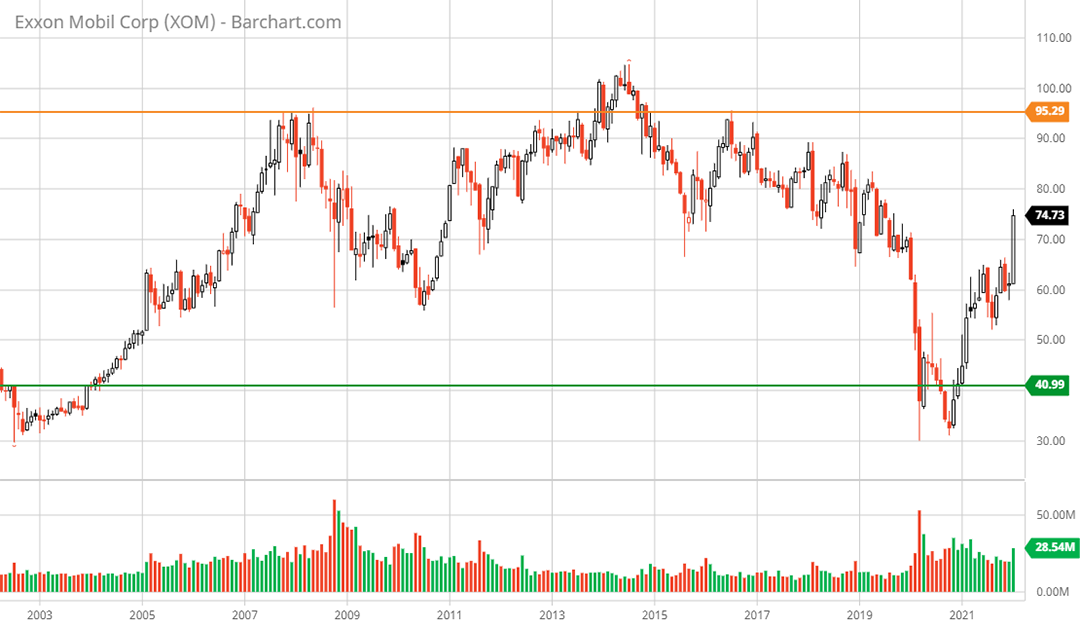
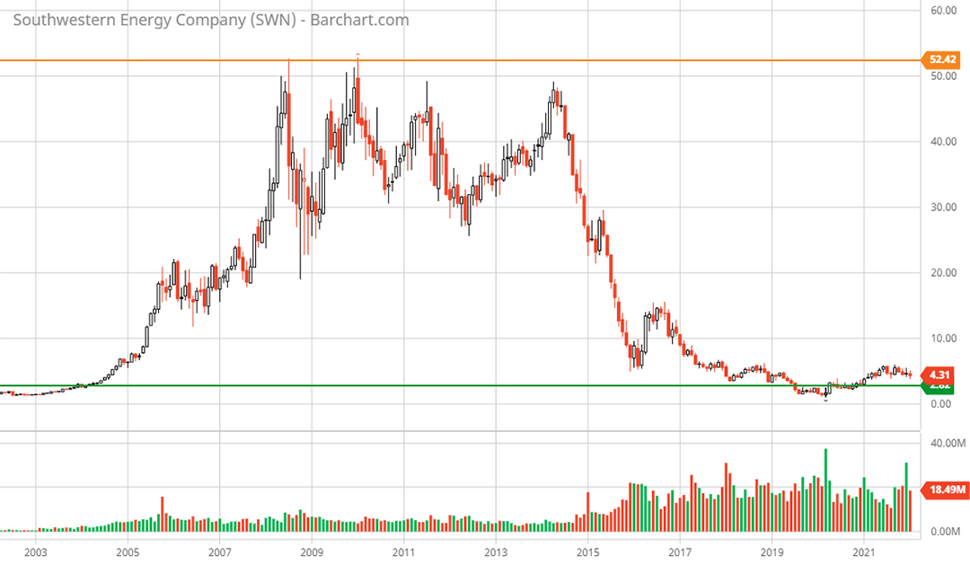
To conceptualize how a large resource discovery creates upside leverage in a commodity bull market, it is helpful to look at a historical example. In this regard, I view the oil and gas bull market between 2004 and 2008 as being an excellent case in point. Energy prices were rising during this period which lifted all boats in the energy sector. However, the performance differentials were extreme. The differential performance dynamic is perfectly captured by comparing Exxon Mobil (NYSE:XOM) and Southwestern Energy (NYSE:SWN) during the period from January 2004 to June 2008. The following 20-year monthly charts for each capture the essence of upside commodity price leverage.
Exxon Mobil 20-year monthly chart. Created by Brian Kapp using a chart from Barchart.com
Southwestern Energy 20-year monthly chart. Created by Brian Kapp using a chart from Barchart.com
The green line in each chart represents the share price of each company as of January 2004, while the orange line represents the share price as of June 2008. Keep in mind that Exxon Mobil was a steady blue-chip performer with limited resource growth potential. On the other hand, Southwestern Energy was a smaller company producing at a much smaller scale while simultaneously discovering a large shale gas resource using horizontal drilling technology.
The performance differentials during the bull market were extraordinary. Exxon Mobil’s stock price appreciated 132% over this period while Southwestern Energy’s share price exploded by 1,833%. In dollar terms, $10,000 became $23,200 invested in Exxon Mobil and $193,300 invested in Southwestern Energy. The primary driver of the incredible outperformance by Southwestern Energy was its undeveloped resource growth. This resource growth return differential was common across the entire energy complex and other commodity sectors during this period. The lesson in the above example is that commodity bull markets tend to reward resource growth, which translates into future production growth.
Great Bear Resources
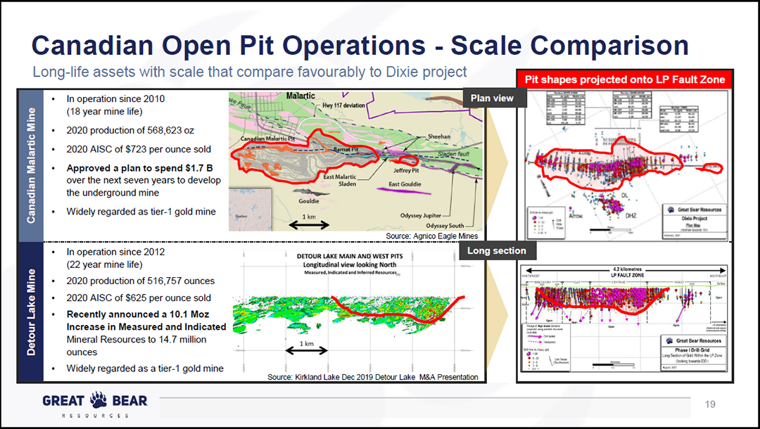
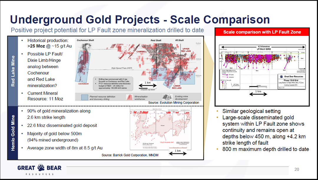
The Great Bear discovery is best illustrated by using slides from the Great Bear December 2021 Investor Presentation and the Kinross Gold January 2022 Investor Presentation. Comparisons to similar mineral deposits at large existing Canadian gold mines places the opportunity in context in the slides that follow. In the case of Great Bear, the opportunity is threefold.
First, the LP Fault Zone discovery creates the potential for a large, high-grade open pit mine followed by high-grade underground mines. The best comparable mines for the LP Fault Zone opportunity include Canadian Malartic owned by Yamana Gold (NYSE:AUY) and Agnico Eagle Mines (NYSE:AEM), Detour Lake owned by Kirkland Lake (NYSE:KL) which is merging with Agnico Eagle Mines, and the Hemlo mine owned by Barrick Gold (NYSE:GOLD).
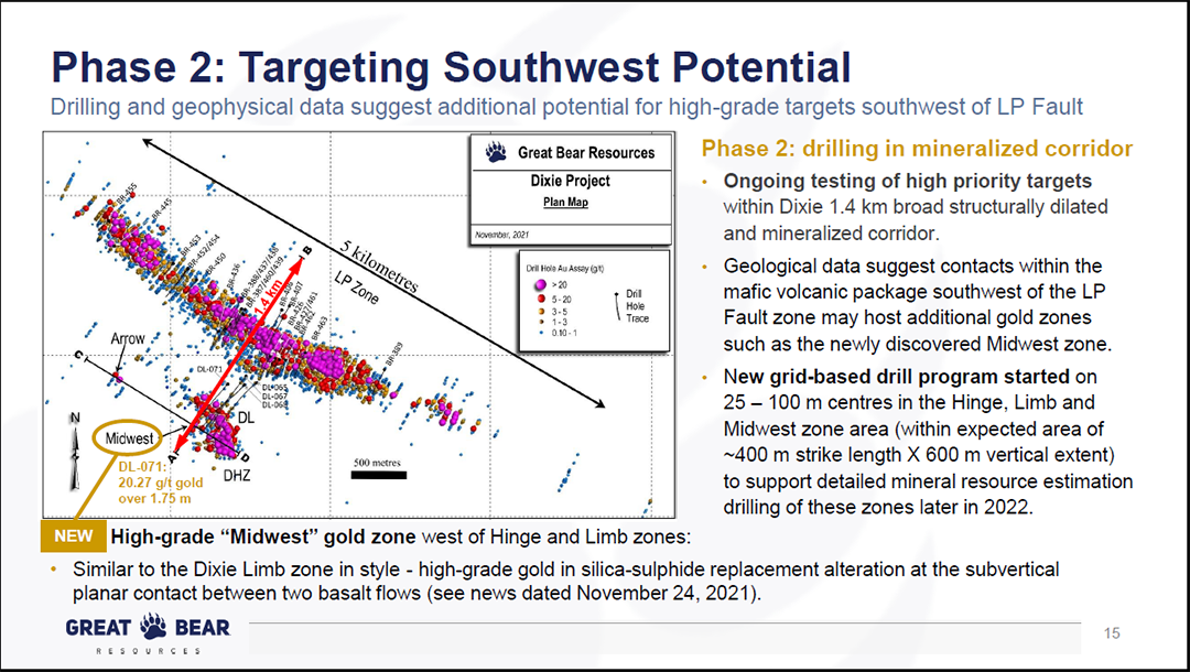
Second, there are now four high-grade satellite deposit discoveries: Dixie Limb, Hinge Zone, Midwest, and Arrow. The best comparable geology to these high-grade satellite deposits is the Red Lake mine just north of the Great Bear property which is now owned by Evolution Mining (PINK:CAHPF).
The third opportunity lies within the large land package that remains largely unexplored. It hints at the potential for the above two types of mineral deposits to be discovered along the same geologic trends within the property boundary.
Turning to the first opportunity, the following two slides compare the size of the LP Fault Zone discovery and drill results to comparably-sized existing mines. Please note that the Great Bear discovery is generally referred to as the Dixie project and the LP Fault Zone drill results data is on the right-hand side of the slides.
Source: Great Bear December 2021 Investor Presentation
Source: Great Bear December 2021 Investor Presentation
The next slide highlights the second opportunity which is the various high-grade satellite deposits. These deposits are higher-grade in condensed formations and are thus more similar to the geology of the Red Lake Mine in the above comparable mines slide. They are to the southwest of the LP Fault Zone and in the lower left of this aerial view slide.
Source: Great Bear December 2021 Investor Presentation
You’ll notice the reference to Phase 2 on the above slide. Great Bear wrapped up its Phase 1 drilling plan in 2021. It is moving to more detailed testing at depth in the LP Fault Zone and more extensive drilling near the Red Lake style deposits to the southwest.
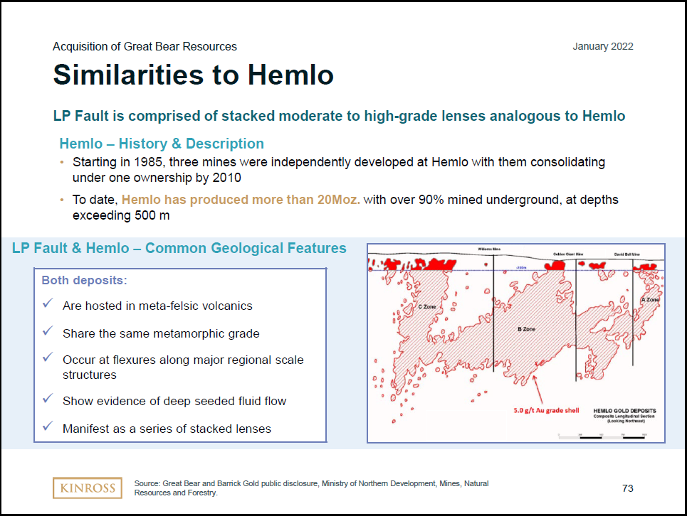
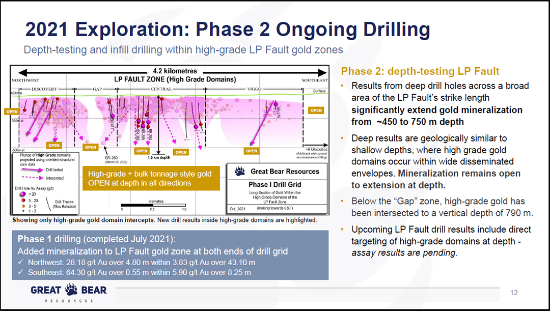
This is important as these drill results will be unfolding in the coming years which creates the potential for positive news flow on the resource growth front going forward. Recall the Exxon Mobile and Southwestern Energy example. It is important to note that much of the overall resource potential often occurs at depths below 500 meters which is not yet extensively drilled by Great Bear. In the case of Hemlo, 90% of the 22 million ounces of gold were mined beneath 500 meters. The following two slides highlight the Hemlo mine and the large resource discovery opportunity at greater depths.
Source: Kinross Gold January 2022 Investor Presentation
Source: Great Bear December 2021 Investor Presentation
It is important to note that Kinross has been in contact with Great Bear since 2018 to monitor and study the progress of the exploration program. This provides further confidence that Kinross understands the risks and resource potential. The following table summarizes the production details of the comparable mines in the above slides. Please note that the potential to reach the size of the comparable mines remains an open question. Actual results could be materially different, whether to the upside or downside. As things stand, all signs point toward more similarities than differences.
Source: Created by Brian Kapp, stoxdox
Kinross Gold: Current Operations
The Great Bear acquisition creates upside share price leverage to resource growth as was exemplified by Southwestern Energy in the example above. That said, Kinross is already the fifth largest gold producer in the world. As a result, the upside leverage potential from resource growth is considerably less than was the case with Southwestern Energy. Luckily, Kinross offers other return levers to compliment resource growth.
Production Profile
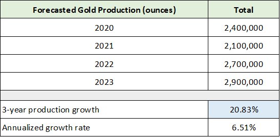
Kinross is unique amongst the world’s largest gold producers in that its estimated production growth between 2020 and 2023 stands at 21% compared to relatively flat production from its largest peers. The following table was compiled from the Kinross Gold January 2022 Investor Presentation referenced above and displays the company’s production guidance through 2023. I have highlighted the key growth rate in blue.
Source: Created by Brian Kapp, stoxdox
Please note that the 2021 production dip was caused by a fire at one of Kinross’s largest mines, the Tasiast mine, which has been repaired and is now back online. Kinross has peer-leading production growth through 2023 and a robust growth opportunity from the Great Bear acquisition later in the decade. As a result, a key question surrounding the investment case for Kinross is the production profile between 2023 and 2028. The 2028-time frame is a reasonable expectation for production from the Great Bear acquisition. It should be noted that the company has not provided guidance regarding the anticipated size of the Great Bear opportunity or when production might begin.
Current Mine Plans
To create more clarity around the 2023 to 2028 production potential for Kinross, I have reviewed each of the company’s existing mines as well as mines that are well along in the development pipeline. The following table presents key details for each of Kinross’s operations. Please note that the Production column is full year 2020 production, and 0 represents a mine in development and not yet producing. The table was compiled from the Kinross Gold January 2022 Investor Presentation.
Source: Created by Brian Kapp, stoxdox
I have highlighted in blue the mines that are on plan to drive production growth through 2023 while the other mines should fluctuate around 2020 levels over the coming years. There are no clear threats to production until 2025, when two mines face potential end of life. I have highlighted these 2025 risks in yellow.
The primary threat is the Kupol-Dvoinoye operation in Russia. This is due to it being the second largest producer with top-tier profit margins. It should be noted that Kinross has a 25-year operating history in Russia, with excellent business relations and an ongoing development project at Udinsk. An extreme event would be required for the Russian mines to experience material geopolitical risk. Kinross is headquartered in Toronto and the mines are in remote regions utilizing workers from as far away as Brazil.
The following table contains my summary notes on each of the key producing mines. It adds further color to the current mine plan (the Mine Life column above) and life extension opportunities beyond the current mine plan timelines.
Source: Created by Brian Kapp, stoxdox
The key takeaway from the Notes column is that each of Kinross’s key mines offers significant potential to extend the existing mine life plan. Prior to 2030, the Kupol-Dvoinoye mine remains the primary risk. This is a high-grade underground mine in a caldera geologic setting. This type of deposit lends itself to high-grade feeder zones and veins. In fact, the current mineralization veins are open in multiple directions and at depth. Open here means that there are no signs of the gold deposits being cutoff or terminated geologically. As a result, Kinross is able to continue following the gold deposits wherever they may lead. Due to this geologic reality, the Kupol-Dvoinoye mine has a long history of continual life extensions.
The Chirano mine in Ghana is also a risk and has a current mine plan ending in 2025. Similar to Kupol-Dvoinoye, this mine features several gold deposits that remain open at depth allowing for potential mine life extension. Additionally, Kinross is conducting ongoing exploration drilling on the property which may unlock further resources near the existing mine operations.
It is important to note that many of today’s mining success stories feature discoveries at existing mining operations. Essentially, the best place to find gold is where there is gold due to the geological dynamics surrounding gold deposits. The gold flows from the bottom up and is deposited along the way leaving the flows to be discovered at greater depths and in different directions.
Current Growth Plans
There remains significant potential to extend the mine life across Kinross’s entire portfolio. The 2P Reserves column in the mine detail table above reflects total proven and probable reserves of 33 million ounces. At a production rate of 2.9 million ounces, which is forecasted for 2023, these reserves cover approximately eleven years of future production thereafter. In terms of mine life extension, the total resource potential of the assets is substantially higher than the 33 million ounces of current 2P reserves. The large total resource potential underpins the excellent prospects for mine life extension from existing operations.
Moving on to current growth projects, I have summarized the three new mines scheduled for future production in the upper portion of the table below. This data was compiled from the Kinross Gold January 2022 Investor Presentation. I have highlighted in blue the expected production growth from the three new mines. In the middle section of the table, I have summarized the at-risk production given the current mine life plan. The total production at risk is highlighted in yellow.
Source: Created by Brian Kapp, stoxdox
Notice that the production growth plan for mid-decade could be fully offset if the end-of-life plans at the three existing mines materializes. The two Chilean mines are scheduled to be produced sequentially. As a result, Lobo-Marte will replace La Coipa while adding incremental production. Additionally, there is material upside opportunity for Lobo-Marte. I discussed Kupol-Dvoinoye and Chirano above in regard to the prospects of a 2025 end of life for each mine. There is a high likelihood they are both extended and may receive additional mine life from regional exploration around the existing mine infrastructure.
At minimum, Kinross’s 2023 production forecast of 2.9 million ounces per year looks to be sustainable through the end of the decade. Additionally, there is significant potential to extend the mine life of Kupol-Dvoinoye and Chirano, which could enable growth toward 3.5 million ounces of annual production in the mid-decade time frame. If this transpired, Kinross would achieve 22% production growth compared to the forecasted 2023 production of 2.9 million ounces. This would mirror the growth from 2020 to 2023.
I have taken the liberty to place an estimate on the timing and potential production from the Great Bear acquisition (there is no guidance in this regard from either company). Recall from the comparable mines table above that the average production for the first 30 years at the Hemlo mine was 733,333 ounces per year.
The 2028-time frame is in line with the six years required to bring the Canadian Malartic mine to production after first discovery. Keep in mind that Great Bear made the discovery at least four years ago so the 2028 timeline would be approximately ten years from discovery. I view the above estimates as reasonable though necessarily speculative on my part. This is especially true pertaining to the annual production potential as this is unknowable at the current stage of development.
All told, Kinross has created a high degree of visibility in its mine plan with the caveat that things happen unexpectedly in the mining business, good and bad. The visibility favors a continuing production growth profile for Kinross into the 2030s. It appears likely that this growth could be in the mid-single digits per year which is close to the 6.5% annual growth expected between 2020 and 2023. If this can be achieved, Kinross would be performing at the top of its peer group and would likely be valued similarly at minimum.
Consensus Earnings Estimates & Valuation
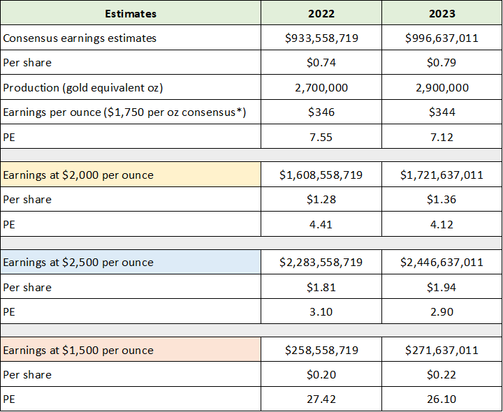
With a strong fundamental underpinning into the 2030s, the future looks fairly bright for Kinross. This is a suitable time to review the current earnings estimates and valuation of Kinross to understand what the marketplace is pricing into its shares. The following table was compiled from Seeking Alpha and displays Kinross’s current consensus earnings estimates through 2023 and the related price-to-earnings multiples.
Source: Seeking Alpha. Created by Brian Kapp, stoxdox
I have highlighted the earnings estimates for the coming years. Kinross is trading at an incredibly low valuation of 7.5x the 2022 consensus earnings estimate and 7x that for 2023. The two top peers for Kinross are Barrick Gold and Agnico-Eagle Mines, each of which are valued at 17x the 2022 consensus earnings estimate. Kinross is trading at a deeply discounted valuation. It is clear that the opposite of a bright future is priced into Kinross’s share price.
Gold Price Backdrop
Feel free to skip this section if you have read my Barrick Gold or Agnico Eagle Mines reports, as this is a rehashing with updated charts and some Kinross detail added. Nonetheless, the fundamental and technical backdrop for the price of gold is a key variable for the Kinross investment case.
Shares of most gold miners have been in a bear market or overall sideways trend for the better part of two decades. The first decade of this trend featured an explosive bull market in the price of gold, rising over 500%. This bull market phase caused excitement in the mining industry and created an upward trend for the stocks. Caught up in the excitement, the mining companies lost their financial discipline and became overleveraged in their pursuit of growth opportunities.
When prices peaked in 2011, the mining stocks entered a brutal bear market which finally bottomed in 2015. Since 2015 the stocks have been basing sideways, unable to sustain a renewed uptrend due to the overleveraged balance sheet hangover from the prior bull market. The industry has largely eschewed growth investments since the last peak as companies focused on stabilizing their balance sheets. Currently the industry continues to favor conservatism and consolidation over risk-taking on new mine development projects. In this respect, Kinross Gold is unique in leading on the growth front with the Great Bear acquisition.
The lack of new mine investment will continue to restrict supply as the lead time to bring new mines online is substantial. This dynamic is fundamentally bullish for the price of gold. It points toward sustained and materially higher prices being necessary in order to compensate miners for the time and price risks they must carry, as well as the renewed risk of cost inflation.
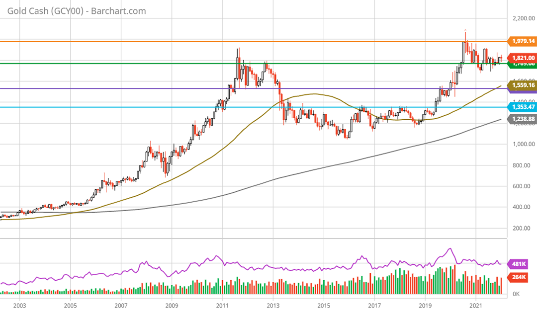
With a fundamentally bullish supply and demand balance resulting from industry conservatism, one would expect the technical setup for gold to be bullish as the market prices in the favorable dynamics. Looking at the 20-year monthly gold price chart below confirms this is the case.
Gold 20-year monthly chart. Created by Brian Kapp using a chart from Barchart.com
The price of gold has established a near perfect 10-year cup and handle pattern (as can be seen above). In fact, the price surged to a new all-time high near $2,075 per ounce in August 2020. This suggests the price of gold is building upside energy for a breakout from the 10-year sideways cup and handle pattern.
There are four well-defined support and resistance levels that have been carved out over the past decade, which are represented by the horizontal lines on the chart. All-time high monthly resistance is denoted by the orange line. A breakout above this level near $2,000 would signal a resumption of the uptrend that began in June 2019.
Trading near $1,820, the price is currently sitting just above support at $1,770 (the green line). This level represents monthly all-time high resistance from 2011 and 2012. If gold finds strong support here and breaks out to the upside, the read through would be extraordinarily bullish.
The next lower support level is at $1,526 (the purple line) which was resistance throughout 2019. It would not be surprising if a retest of this level occurs. A retest of the $1,500 area would likely serve as a washout event and create a potential high-energy slingshot move to the upside. This level should offer extraordinarily strong support.
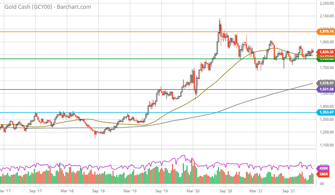
The worst-case scenario appears to be down to support at $1,350 (the blue line). As mentioned above, this should provide a floor because gold supply would shrink quickly as marginal mines and projects would become unprofitable. Furthermore, $1,350 is the level from which the current gold uptrend was established. A better view of the current primary trend is visible on the 5-year weekly chart below.
Gold 5-year weekly chart. Created by Brian Kapp using a chart from Barchart.com
As can be seen on the weekly chart, the primary trend for gold is up. The current bull market became official with a break above the key level of $1,350 in June 2019. The first leg of the new bull market peaked in August 2020 at $2,075 for a 54% advance. $1,700 per ounce represents a 50% retracement of this initial bull market leg higher, while $1,575 represents a two-thirds retracement. These are common retracement amounts and lend credibility to the key support levels of $1,770 and $1,526.
Kinross: Potential Return Spectrum
Combining Kinross’s strong fundamentals, discounted valuation, and exciting resource growth leverage with the bullish fundamental and technical backdrop for gold, there is a compelling case to be made for estimating upside return potential. In the following table I estimate Kinross’s earnings potential under various gold price scenarios. I assume Kinross’s all-in cost per ounce remains in the $1,400 area which looks to be embedded in consensus earnings estimates.
Source: Created by Brian Kapp, stoxdox
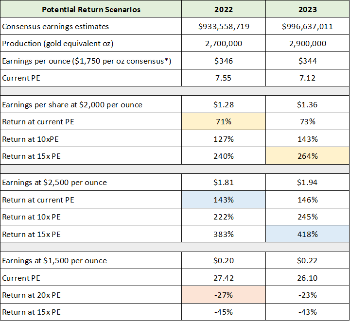
Kinross’s valuation would be at an incredibly low 4x to 3x earnings under the $2,000 and $2,500 gold price scenario, respectively. As discussed in the gold price section, $1,500 is an extraordinarily strong support zone and looks to represent the most likely downside potential. Under this scenario, Kinross would currently trade near 27x earnings. If $1,500 is the likely cycle low for gold, Kinross could hold near the current price level given this 27x PE would be on the low earnings level for the cycle. The following table displays the return potential at various price-to-earnings valuation levels for the above earnings estimates.
Source: Created by Brian Kapp, stoxdox
I view $2,000 per ounce as a very reasonable estimate near term. In this environment, the upside-return potential ranges from 71% to 264% at a 7.5x and 15x PE, respectively. This return spectrum serves as an excellent baseline projection to the upside. At $2,500 per ounce, the same return spectrum is 143% to 418%. Given the strong fundamental and technical backdrop for gold, a 35% rally to the $2,500 range is well within the realm of reasonable expectations in a gold bull market.
If the downside scenario for the price of gold plays out, I would estimate a 20x PE multiple on cycle low earnings to be a bottom. This would result in 27% downside potential. This downside estimate also receives strong technical support for which Kinross is now testing.
Technicals
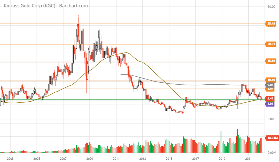
The technical backdrop for Kinross fully supports the potential return spectrum of -27% to +418% outlined by the fundamental estimates above. The primary technical support levels are highlighted by the green and purple lines on the 20-year monthly chart below, while the orange lines represent the primary resistance levels.
Kinross Gold 20-year monthly chart. Created by Brian Kapp using a chart from Barchart.com
The purple line near $4 looks to offer extremely strong technical support as it was a key resistance zone during the 6-year W-bottom formation between 2013 and 2019. This should be a worst-case scenario given the strong business fundamentals reviewed above. At $4 per share, the downside return would be -27%. This is precisely in line with the downside return potential estimated above in the most likely scenario with Kinross trading at 20x cycle low earnings.
Turning to the upside, the potential return spectrum from the low to high resistance levels is 47% to 367%. The upside technical targets (resistance levels) are highlighted by the orange lines. This technical return spectrum fits very well with the fundamental upside return spectrum of 71% to 418% outlined above.
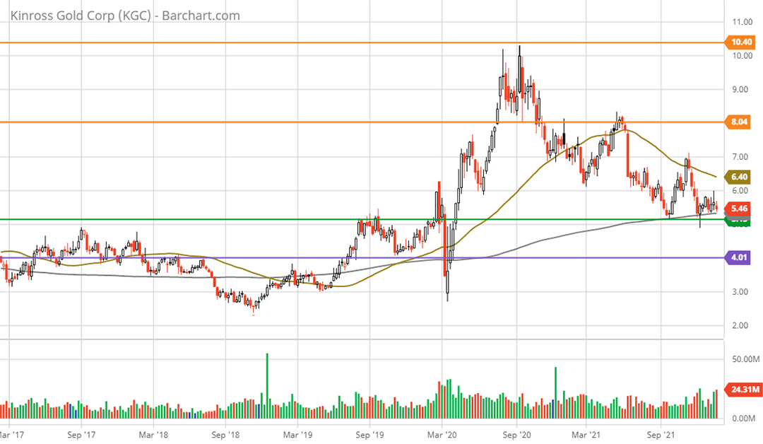
The following 5-year weekly chart provides a closer look at the current setup in relation to the nearest support and resistance levels. The green support line represents the breakout level from the 6-year W-bottom formation (as can be seen on the monthly chart above). This should be a strong support zone.
Kinross Gold 5-year weekly chart. Created by Brian Kapp using a chart from Barchart.com
Summary
Kinross Gold represents the essence of an asymmetric growth opportunity. The shares have incredibly strong fundamental and technical support on the downside. When this downside protection is combined with extraordinary fundamental and technical upside potential, the situation manifests as a uniquely asymmetric growth opportunity.
Price as of report date 1-27-22: $5.31
Kinross Gold Investor Relations Website: Kinross Gold Investor Relations


